Paul Alper writes:
You recently posted my moving and widening the goalposts contention. In it, I mentioned “how diagnoses increase markedly while deaths are flatlined” indicating that we are being overdiagnosed and overtreated. Above are 5 frightening graphs which illustrate the phenomenon.Defenders of the system might (ludicrously) contend that it is precisely the aggressive medical care that is responsible for keeping the cancers under control.The prostate cancer graph is particularly interesting because it shows the peaking of the PSA-driven cause of treatment in the 1990s which then falls off as the evidence accumulates that the PSA was far from a perfect indicator. In contrast is the thyroid cancer which zooms skyward even as the death rate is absolutely (dead) flat.
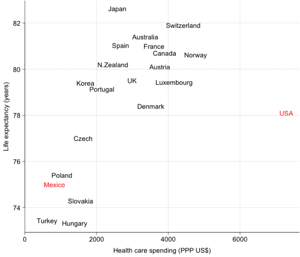
And of course here’s the famous cross-country comparison that some find “schlocky” but which I (and many others) find compelling:
via:http://andrewgelman.com/2014/02/10/us-health-care-overkill/?utm_source=feedburner&utm_medium=feed&utm_campaign=Feed%3A+StatisticalModelingCausalInferenceAndSocialScience+%28Statistical+Modeling%2C+Causal+Inference%2C+and+Social+Science%29

No comments:
Post a Comment